3 key takeaways from google’s new logo
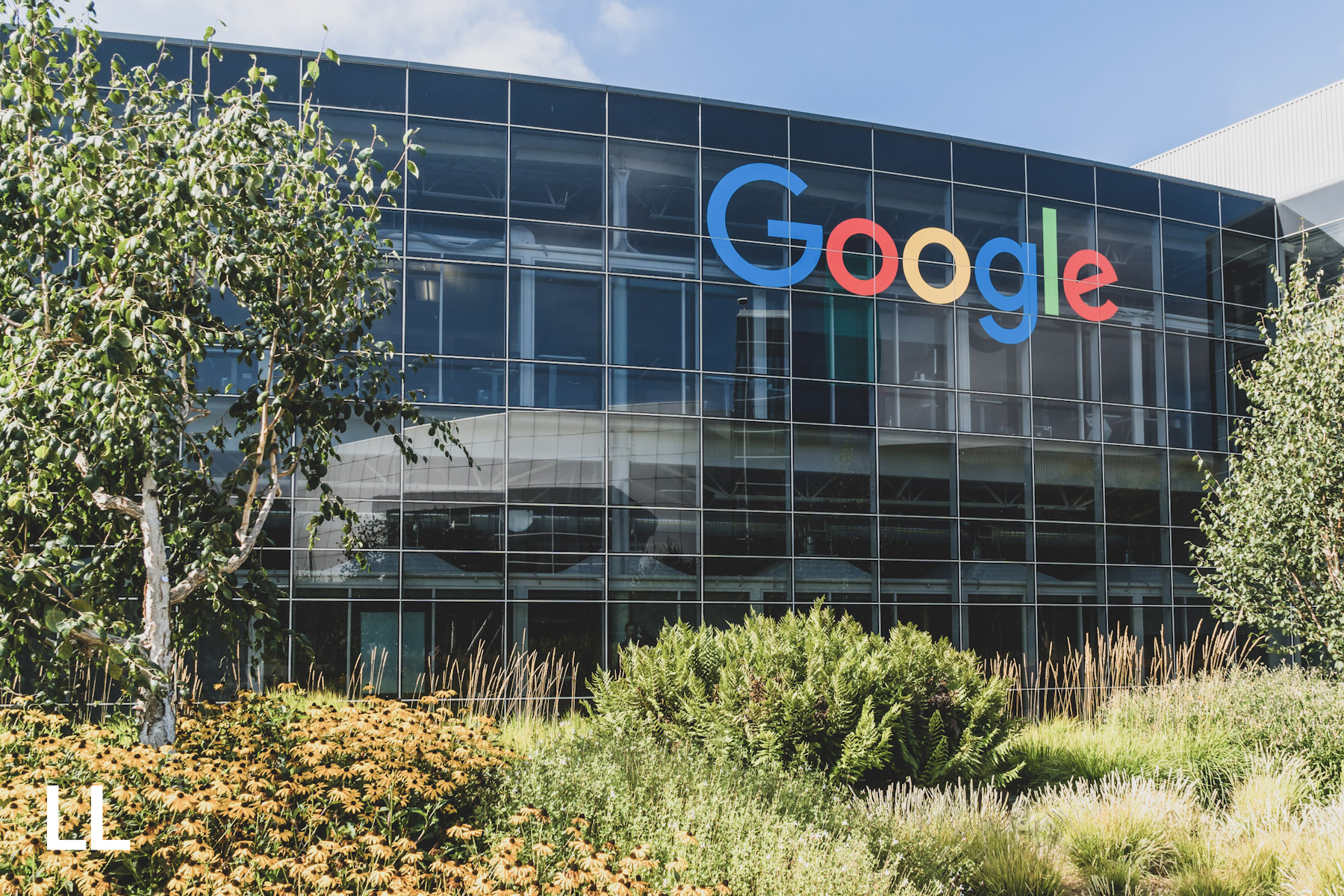
Google today unveiled a new logo that would become the brand’s biggest singular visual change since its inception in 1999. Unveiled with a Google doodle displaying an animation that wiped off the old logo and replaced it with a new one, Google presented a bold, sans-serif logo that will adapt and scale better than its predecessor. While the new logo may not seem like a significant update, there were incredibly important decisions that went into this transformation of type and its impact on user experience across Google’s suite of products.
sans serif front & center
Traditionally, in journalism, serif fonts were always preferred for readability for text as the small ligatures on each letter helped guide the eye from left to right and improved the speed of readability of the text. However, more and more brands continued to look toward sans serif fonts to stamp out their identity; in fact 15 out of the 20 most popular brands for shopping all use Helvetica, a sterile, sans serif font that oozes neutrality. Yet, due to its ubiquity in the American commercial sphere, Helvetica loses a bit of identity for a brand in the process.
Google’s choice of a sans serif typeface does help make the brand feel more contemporary and modern, and is a nice bookend to the beginning of Google’s existence under the Alphabet moniker. However, their choice strayed far from Helvetica, and instead uses a typeface that was designed internally at Google. Rather than go with another font that is slightly synonymous with the Google brand in Roboto, Google created a typeface called Product Sans that would allow them to retain some of the characteristics of other typefaces but retain a unique brand identity.
Drawing cues from some of the typefaces synonymous with the Android platform, like Roboto and Droid Sans, Google’s Product Sans is a modern typeface that has bold lines and extra large counter on the capital G. In addition, the playful tilt on the lowercase ‘e’ helps the brand capture some youthful enthusiasm.
The primary reason for the switch to a Sans Serif font lay in the fact that our reading habits have changed so drastically. When Google used to be only accessible via a PC, a bold, sans serif logo felt intuitive for the brand. Now, as users incorporate Google into their daily lives on the go, Google wanted to ensure that its brand identity would seamlessly transcend to whatever device a user may have when using a Google product.
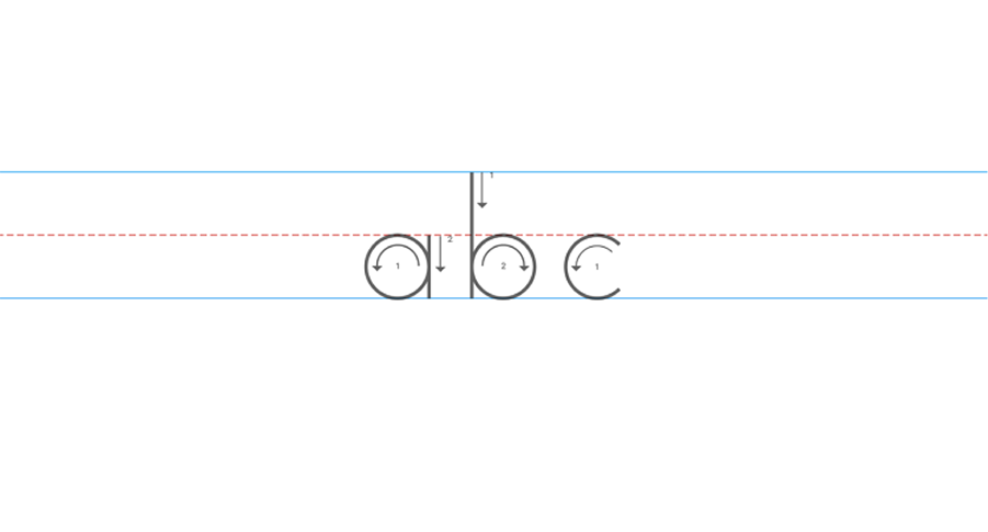
Sans serif fonts have thick, streamlined glyphs that can scale well, shrinking down without the unnecessary decoration of serifs, which are primarily flourishes that don’t influence the structure of a character.
“Today we’re introducing a new logo and identity family that reflects this reality and shows you when the Google magic is working for you, even on the tiniest screens.”
Color Palette Update
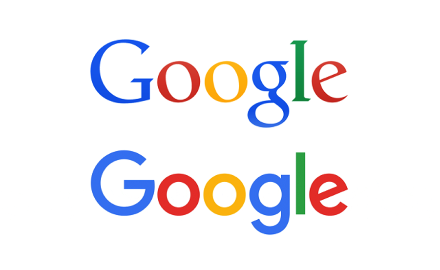
Another update to the Google logo came in a subtle update on their color palette. Though it may be difficult to see on some screens, Google has brightened the colors to give the logo a bit more pop against the white background. Nearly every color reflects a hue that is brighter and in conjunction stands out against the white background.
According to Google, “The Google logotype benefits from whitespace between letterforms, but when colors are adjacent—as in the case of the Google G—they optically blend and can result in a darkening and dimming of the original value. We adjusted and pushed the vibrancy of the red, green, and yellow to maintain saturation and pop.”
This is all done for a very particular effect, and something that brands would do well to remember: your logo is meant to impart the visual identity of the brand, but also part of the brand values and mission as well. Google’s choice in terms of color are meant to echo their commitment to their company being an unconventional one, and also one that harks to a simpler time.
“We wanted to retain these qualities by combining the mathematical purity of geometric forms with the childlike simplicity of schoolbook letter printing.”
nothing but a g thing…
In addition to the updates above, Google truly became a digital-first brand.
“Google’s logo is no longer a static wordmark. Like many brands, they’ve shifted from a paper-first, static logo to a dynamic, animated figure that’s only possible on screens,” said Fast Company.
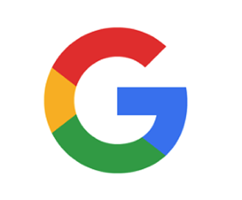
The single G comprised of all four colors, along with four colored animated dots will now dictate the Google search experience. The multi-colored capital G will begin to replace any instance of the solitary lowercase ‘g’ that often appeared as a favicon on many Google sites. However, in addition, Google is also leveraging animation. A series of four colored dots will help guide users through searches as Google looks up information in its index, becoming a truly dynamic, moving part of the company’s visual identity.
What do you think of Google’s new look?